| |
This
section will help you understand various technical difficulties/situations
for using fonts on your web pages.
Specifying
particular fonts and styles on a web page can be difficult if you want
to specify a particular font, placement, leading,
tracking, linebreaks(re-flow), hyphenation, etc. (i.e., particular
treatment/placement for the text). When
a web page is displayed in a viewer's browser, for html live text, it
all depends on which fonts are installed on that person's
computer. If
you want an exact replication of your page layout and fonts,
then you should make a graphic "picture" of the type & layout, or convert
to PDF,
both of which are more cumbersome to produce and maintain, and take longer
for the viewer to download.
Even though you specify web page text to use a specific typeface, it really depends on the browser and the platform it's running on (PC, Mac, Linux, WebTV, Blackberry, etc.)
-
Font Availability. When you tell your Web page to use a particular font, such as "Times" the viewer may not always see the font you specified. Fonts are a computer resource, and not all computers have the same fonts installed as you do on your computer. That's true between different PCs, but it's especially true between the PC and the Mac. If the typeface you specified does not appear the same way on someone else's computer, you've probably used a font that isn't available on their computer. The only guaranteed fonts (based on how browsers work) are a very few generic fonts (sans(Arial-style), serif(Times-style), Courier-style)
-
Font Size. The Mac will generally render your typeface in a smaller pixel size than the PC does. That's especially true if you use the FONT tag to set your type size, since this tag uses abstract units to define size. You can avoid this problem is you use Cascading Style Sheets to set your font size in pixels.
-
Internet Explorer. Microsoft outsourced the development of Internet Explorer for the Mac, and to a large extent the Mac version really is a different browser from the PC version. In particular, Mac IE is prone to quirks and bugs that you won't see in the PC version. If you check your Web page under only one browser(there are several: IE, Safari, etc.) on the Mac, do so under Internet Explorer!
Fonts can
be specified and displayed in a number of ways in html-based web pages.
The
three most common "techniques" are:
-
Use HTML tags to specify the font, size, color, bold/italics/underline,
etc. This is, however, left up to the availability of that font being
installed and accessible on the computer system of the viewer.
You may have the font and I may have the font, but likely your customer/reader
won't. If you don't specify an alternative (font search list), then
it's up to the browser to select typically Courier, a generic sans
serif or serif font.
Also, there are few guarantees about how your type will flow on the
page, even though you specify size and table-width, etc., different
browsers and different platforms will render the type differently.
Usualyl this is not a problem.
-
Use CSS Style sheets to specify your type attributes.
This is somewhat more consistent, but still does not guarantee that
font substitution and text re-flow won't occur.
-
Use a Graphic of the type to display as a "picture" of the text.
Other than monitor color and pixel size differences, this will be the
most faithful representation for exactly how the text appears. Note
that the tradeoff is two-fold: Pictures take longer than type to download,
and search engines cannot parse the image in order to catalogue the
terms for finding keywords on your page. Pictures(graphics) of type (text) are not considered accessible (the computer cannot generate audio) for the blind.
The best overall solution is to use a cross-platform authoring tool
such as Dreamweaver and carefully select your methodology based on considerations
of the demographics of your viewers.
NetMechanic provides
a service for a fee to render your web page on multiple combinations
of platforms and browsers and screen sizes so you can view how
95% of the internet world will see you page on their monitor. This is
not usually necessary unless you have a critical page that is high volume
and is not authored with Dreamweaver. Note that FrontPage has many issues
far beyond the whole area of font headaches.
Many
times you just need to settle for a "90% solution" and
go with the (re)flow.
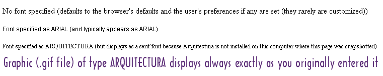
Example of typeface "substitution" for web <font> tags
Below are four screenshots of various treatments of type. They are self-describing (i.e., the description IS the rendered example results for that description).
Tradeoffs/Comparison of Graphic Image of Type vs. "Live" Type
|
Live Type |
Image (Graphic) of Type |
| Download Speed |
Quick |
Downloads a little more slowly due to the .gif file picture downloading |
| Readability (crispness) |
Crisp
Vision challenged are able to adapt the text so they can read it in their own style, as well as voice rendering (altho ALT texts can be used by blind persons) |
Lo-res images (as all are on the web) may appear fuzzy, especially for small point sizes, and for some monitor resolution settings. |
Re-flow &
Page Layout
(words appear exactly on
each line) |
You have little control for where line breaks are in paragraphs or tables, etc. |
WYSIWYG; However, one tradeoff is if you have a wide image, the viewer's browser screen(or monitor) may not be opened to display the full width, and the viewer would need to horizontal-scroll back and forth to read line by line.
Whereas live text is usually rendered in the viewable margins available.
Editing the text (maintenance) may be difficult. |
| Font selection (rendering) |
If you specify a particular font, you get "pot luck" with whatever font is "closest" that is installed on the viewer's computer. Fonts are not conveyed with HTML files. (They are included many times with PDF files.) |
WYSIWYG - whatever font and positioning that was created will be displayed as-is. |
| Forms/tables |
If you can get them formatted reliably in HTML(& CSS), then this is better |
For specific page layouts, you may find it faster to use a page layout program and get the layout perfect. |
| Nav Menus |
Can use CSS and JS easily to have sophisticated effects, many very easily |
Somewhat bulky to implement, and rollovers are an added expense. Only if rendered in Flash are more sophisticated effects/behaviors possible. |
Maintenance/
Editing |
Easily changed in authoring tool or direct HTML code |
Must use Photoshop or equivalent to change text |
| Search Engine Cataloguing |
Catalogues normally |
Spiders will not "read" the text in the picture. You can compensate somewhat with Image descriptive ALT tags. |
| Cross-platform issues |
Many of the above topics are affected by the browser used (IE, Safari, Firefox, etc.), as well as the platform (PC, MAC, Linux, WebTV, PDAs, CellPhones) the viewer has. In addition the monitor size and resolution setup makes a difference in size and clarity (as does Mac vs. PC for basic system resolution). |
Additional References
Article on readability of various typefaces used on the web
Making type appear the same whether displayed on a MAC or a PC
|


